This piece, originally titled ‘Why’, was intended to express my inability to understand mass psychosis. Since puberty, I have been baffled by our collective cruelty. Pogroms, the Holodomor, fascism, state terrorism, the lust for war — you know what I’m talking about. I think I understand now. After all these years. All it’s mechanisms are triggered in real time all over the world.
‘How are you cruel?’ – fine art print on canvas 100×100 cm diagonal
What frustrates me is that by proxy, I am cruel too. I see no way around it. I am complicit through our collective cruelty. Whether I like it or not, I am personally liable for it.
I used to be able to avoid taking responsibility for that cruelty. I read about it in newspapers reporting on events in other parts of the world. I learned about it in history books about other people’s wars. I studied philosophy books about other people’s madness. But as the world gradually and inevitably changes, I find myself being sucked into a dark era. And it is becoming part of who I am.
So, ‘Why’ evolved into ‘How’. The question is no longer why, but how much of it is mine. This festive piece of typographic art is about just that.
The piece has evolved over time. It began with the word ‘Why’ written in code. While working on it, the phrase evolved into ‘Why are you cruel?’ After some iterations, it turned into ‘How are you cruel?’, which led to its final state: ‘How cruel are you?’.
Interestingly, this process reflects my dawning realisation that I am complicit.
I feel somewhat lost in today’s media culture. My workflow is erratic and irregular. Plans can take years to come to fruition and working on a piece can span weeks or even months. This does not sit well with today’s content demands.
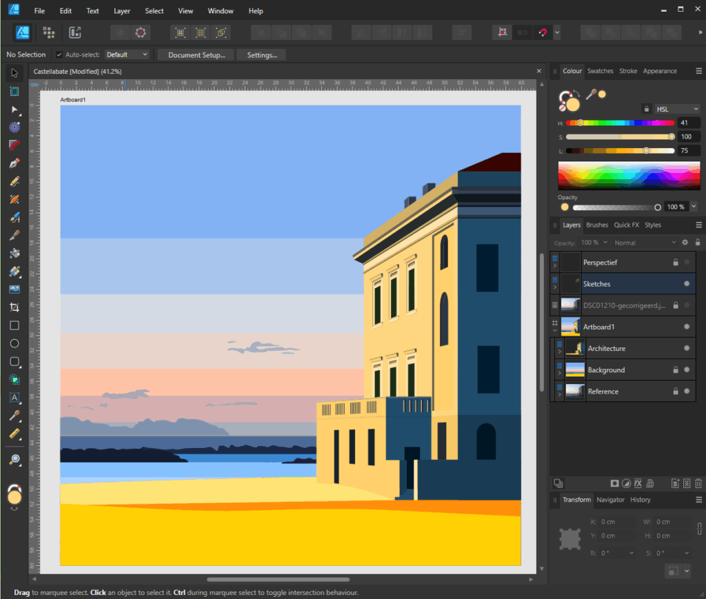
St. Maria de Castellabate, fine art print 80 x 80 cm
This piece, for example. I started working on it in May 2025, triggered by a photograph taken by my wife in St. Maria de Castellabate during our honeymoon. My initial idea was to describe the dusk and the play of light on a classical building that is right on the beach. After the initial draft, it took me months to finish it. I had breaks of several weeks in between versions, during which time I allowed the piece to evolve slowly in my mind.
Maybe it sounds silly, but traveling from A to B like this takes time, more so then effort. It needs time to ripe. To start understanding what it needs, or wants. This process can take ages.
I find that weird. I work with digital technology, which should make creation fluent and maby even quick. But the way pieces slowly ripe makes it almost impossible to produce at a pace that modern media dictates.
St. Maria de Castellabate, thrid draft july 2025Castellabate beach, photograph by Astrid Spit-Steur 2004.
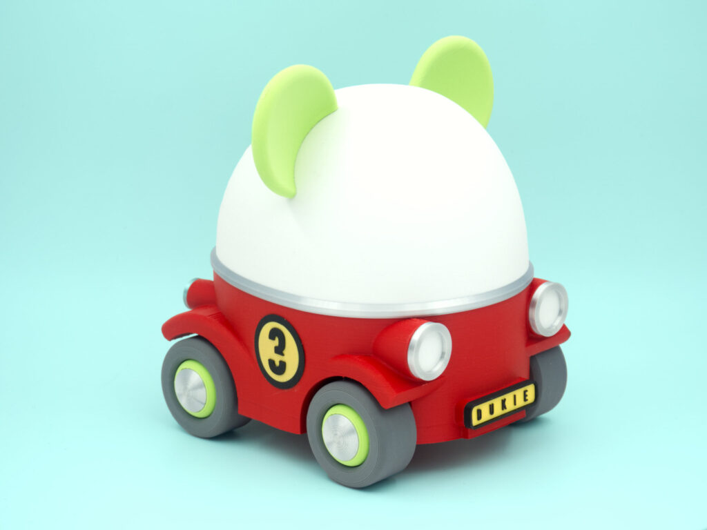
I am working on a cool project! I wanted to make something cool for our three-year-old neighbour, Jason. Jason is always busy drawing on the pavement in front of his house. He uses bright colored street chalk to scribble and draw his doodles almost daily sometimes.
Last summer I talked to him and his parents and asked him if he would make a drawing in front of our house too. He looked up, somewhat shy. “No,” he said. ‘I am afraid to’. We don’t have kids, so for me it’s hard to gage their abilities. I tend to treat them as fully able mostly unless proven otherwise, which is why they probably think I’m weird and funny. “Well Jason, you are more than welcome to draw on our pavement in front of our house at any time you feel ready.” He nodded.
Two months later, our doorbell rang. When I opened the door, Jason’s mother was standing outside, looking a bit nervous. “He told me it was okay,” she said, pointing at Jason beside her, his fists covered in pastel-coloured chalk. Jason had remembered our conversation and had filled our pavement with colored scribbles and drawings. One of them was a drawing of a yellow car.
An artist impression of the car that Jason has drawn on our pavement.
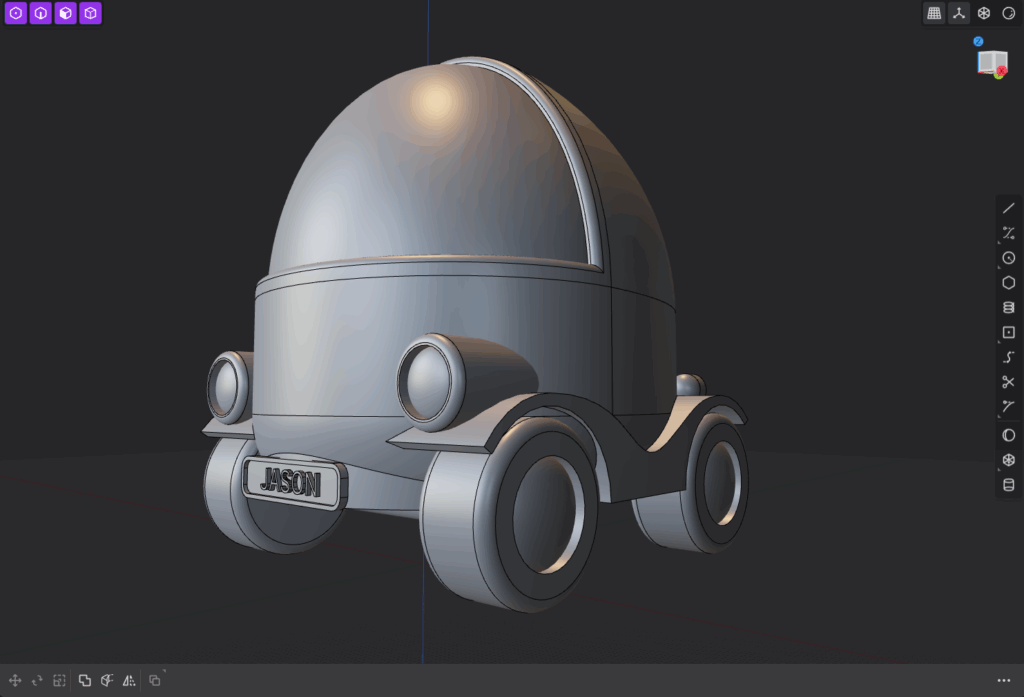
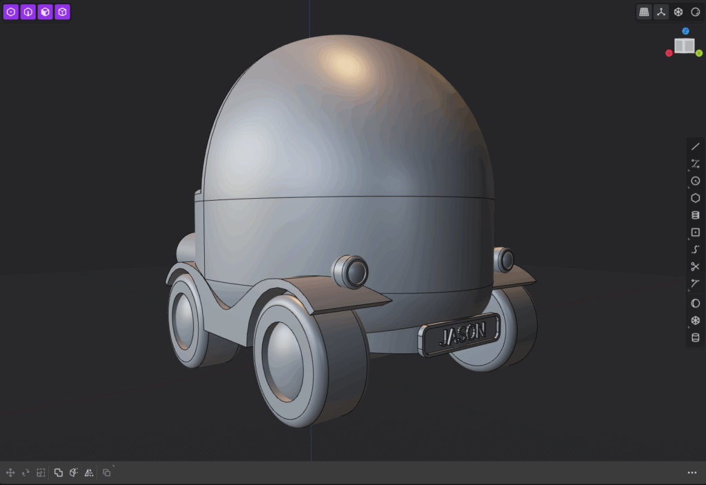
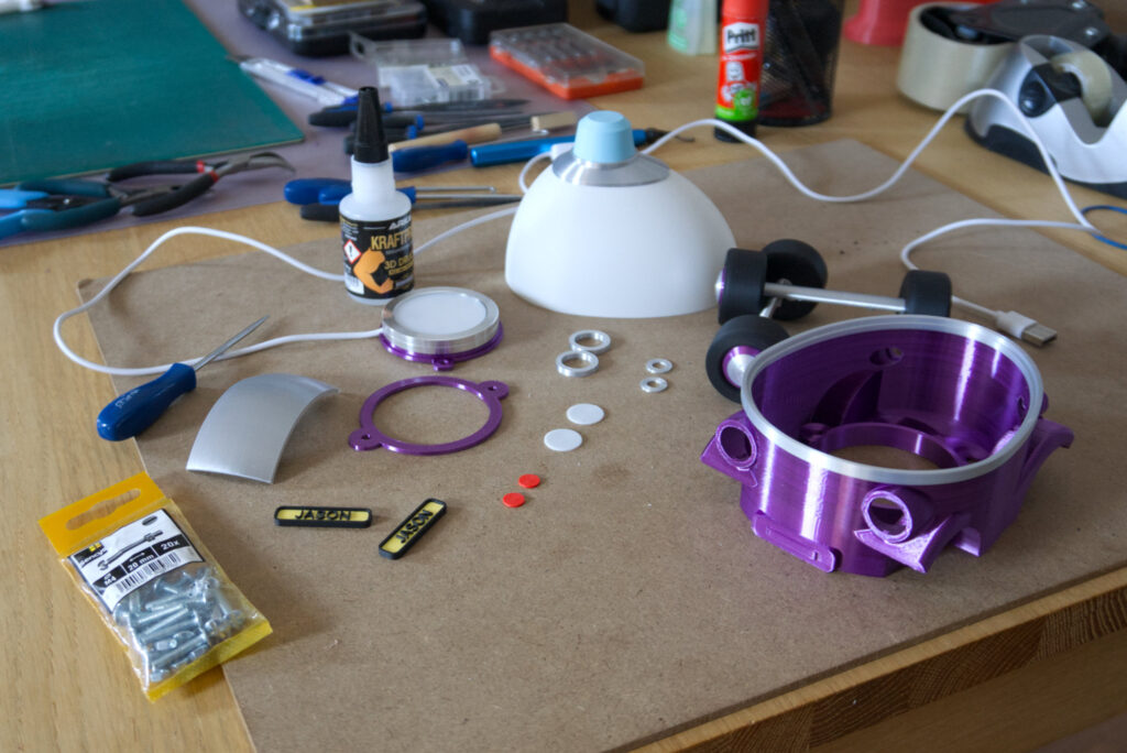
Jason loves cars. And as I was thinking about projects for 3D printing, something I had just picked up, I decided to make him a little gift. I came up with a little car that could function as a nightlight. A little buddy to help him sleep.
The first rough sketch of Jason’s little cruiser
I started printing prototypes. I’ve never made anything like this before. A few weeks later the first model was ready for assembly.
When I handed it to him, he was four years old. He didn’t get it at first, the concept of a light didn’t mean anything to him personally. But as soon as we started clicking the light on and off he got really excited.
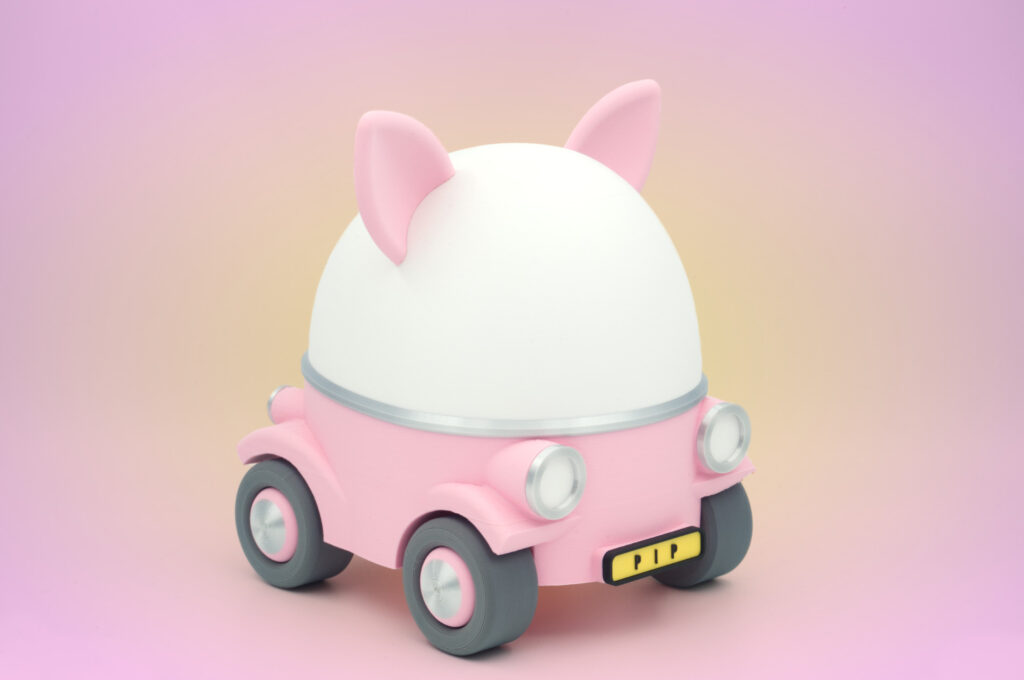
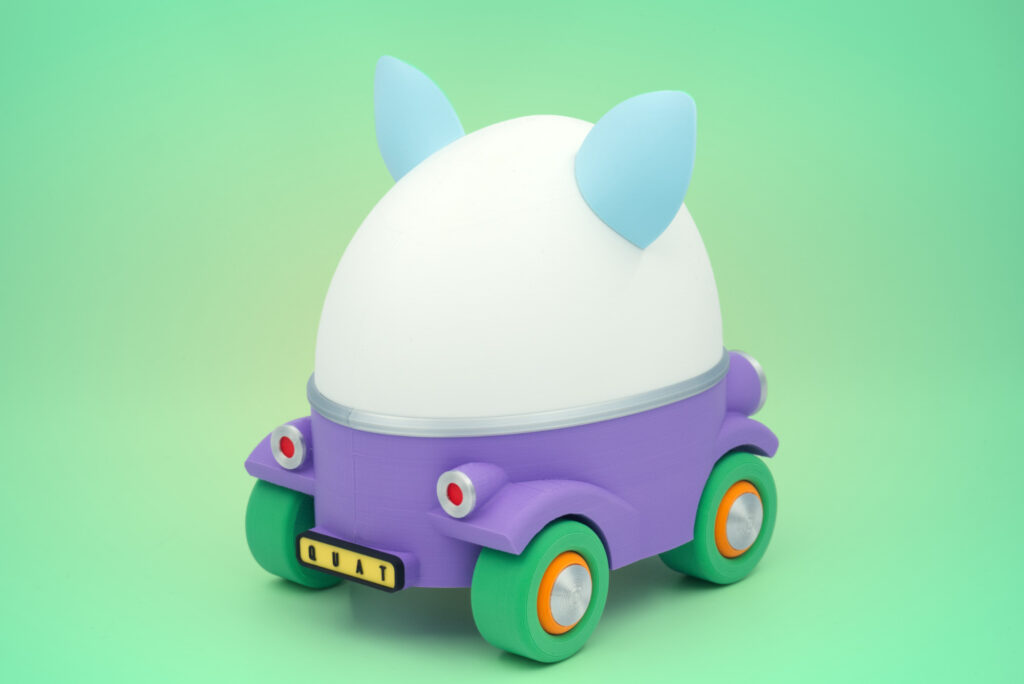
This little cruiser project has evolved into a somewhat larger undertaking. Check out the lastest!
My pen-and-ink drawings, which are simple line drawings like Matisse’s, are blending with the style of vector portraits I’ve created in recent years. I’m currently working on this self-portrait.
Self portrait, digitized ink pen drawing on paper
The first stage involved recreating rough volumes by hand using vector shapes. I like this version in its own right, but it’s not quite what I’m looking for.
SoFLY – Work in progress
I made this next one after looking at watercolour landscapes. I know. It’s stupid. It doesn’t look like an aquarel landscape at all. But trust me, this is what I did after looking at watercolorings. I like this version much better. It’s not what I’m used to, which is good.
Most of the portraits I create start with a brief encounter — a moment when I cross paths with someone who catches my attention. These are not commissions; they are glimpses of people whose faces linger long after they have disappeared into the crowd.
Mickey – fine art print on canvas – 55×55 cm
I recognise a familiar disconnection in the way they carry themselves — a solitude that persists even when they’re with other people. It is their facial expressions that trigger me. The reality of illness or inner struggle is etched into their faces, visible for a brief moment to a passing stranger.
Rokende man 1 – fine art print on canvas
These portraits capture the fleeting vulnerability of awkward expressions, subtle gestures, and confused gazes. I recognise their essence: pure, vulnerable and somewhat lost. In that sense, these are portraits of all of us.
Just as in traditional printmaking, digital graphic artists create images that are transferred to paper or other materials such as metal, fabric or PVC. In digital printmaking, inks and pigments are the words I work with. My tools are code and vectors instead of cutters, brushes or etching needles.
SQ1 – Dye sublimation print on aluminium at 80×80 cm
It should come as no surprise that I love bold colors in my prints. In these vibrant colors I almost feel photons hitting the lining of my retina. This is why I prefer fine art and dye sublimation prints. In traditional art I have a soft spot for dry pastels for that same reason.
SQ1
“SQ1” is the first print in a series of still life “Vibrations”. It’s an exploraion in color and composition, confined in an 80x80cm dye sublimation print. The image is created by writing code in an editor. If you are interested in how that works, check out this blog I wrote earlier about “Scalabe Vector Graphics“.
SQ1 on location (private collection)
The code I write generates a virtual canvas with shapes and color. Depending on the medium, the code creates images on an html pages for use on a website, but it can also be compliled into machine code that printers need to understand what they should be doing.
I love working in code, creating color by plotting in RGB values instead of using a visual colorpicker. It helps me step away from my preferences and biases. I can more easily explore alternative color spaces and bypass my preconceptions about color and composition. I am cheating though. I end up editing every piece by hand, down to the last detail.
On-site photograph of SQ1 (private collection)
You can find SQ1 in the portfolio here. It is also available for puchase in my Ko-Fi shop, here.
Last year a close friend infected me with the 3D printing virus. I’ve been immune for over a decade. I didn’t even consider getting one until he asked me if I wanted his Ender 3 S1 pro. He had moved on to a BambuLab X1 Carbon.
Creality, the company behind the popular Ender 3 series, has played a major role in making 3D printing affordable and accessible to a wider audience, especially those on tighter budgets. I was hooked almost instantly, despite some frustrating printing experiences later on. The Ender 3 is known for requiring regular maintenance, and 3D printing itself can be a demanding and unforgiving. However, as soon as I realised 3D printing turned into a permanent affliction, I began searching for an affordable next-generation printer.
BambuLab’s A1 Mini
The A1 mini with AMS lite module (Image Source: Bambu Lab)
BambuLab’s entry-level models, the A1 and the A1 Mini (2024), are very affordable high quality machines. I was immediately smitten with the A1 Mini. This cute little machine is a true powerhouse. It features automatic bed leveling with nozzle probing, X and Y axis resonance calibration, pressure advance calibration, and even belt tension monitoring. Filament loading and unloading are fully automated with a single touch, and the printer’s active flow rate compensation ensures smooth, accurate extrusion throughout each print. These features let you enjoy reliable results, especially if you’re not interested in the technical side of 3D printers.
The main difference between the A1 and the A1 Mini is the size of their print volume. The A1 has 256 x 256 x 256 mm, the A1 Mini 180 x 180 x 180 mm. This may sound a bit small, but when I went through my previous Ender 3 projects, I found that most of them would fit on the smaller A1 Mini build plate. So I got myself the A1 Mini, and the AMS multi color system.
Plasticity
In addition to a good printer, you need modeling software if you want to print your own designs. I haven’t modeled in ages though, so I had no clue where the software was at. The last software I used was 3DStudioMax. I created scenes for large inkjet prints with it. I also used it as a professional level designer next to the the Unreal Engine.
Large 180×130 cm Inkjet prints designed in 3DStudioMax in 1998.
Checking out the latest CAD apps, I came across Plasticity. This program is marketed as “CAD for artists” and I must say, as an artist, I feel quite comfortable working in Plasticity. There are a few key differences to other CAD solutions. Most CAD and modelling applications use a modeling (or modifier) history feature that allows you to retrace your steps and change aspects on a model that will be propagated through the entire sequence. Plasticity does not have this. It does allows you to revert some aspects on models like bevels or certain boolean operations. But its workflow is mainly destructive. This means that once you apply a change to the model, it will be permanently applied. This sounds like a major drawback, but to me it isn’t actually. Once you get used to destructive modeling, it feels quite natural, and helps making quick and bold decisions even.
My chess set in Plasticiy version 25.1.8
I found Plasticity very intuitive to work with after having learned the basics. It’s interface is very lean and focused. I use very simple shapes in most of my work and mainly do hard surface modelling anyway. Granted, I think Plasticity is not perfect for 3D printing yet, but it is catching up quite nicely.
The Chess Set
The first project I started on the A1Mini was creating a chess set based on a French design from the 18th century. This project turned out to have the perfect learning curve. The modeling ranges from revolving a simple spline curve create a solid pawn, to modeling a horse’s head in Blender in order to create a knight.
The full printed classic chess set
The delicacy of the models need a near perfect execution. I’ve been able to almost completely avoid print support by adjusting the silhoettes and creating assembly parts. I’ve also started using matte PLA for this build. The initial model had an ugly seam on the back of each part. By setting the seam to random, each layer has a small irregularity where the printer starts and stops. The matt quality helps to hide these small seams. I really like the feel and almost chalk like look of matte PLA. It’s kind of chique and elegant for a plastic.
The full black and white set pieces in closeup
One thing I realised is how far these machines have evolved quality wise, but also how slow the 3D printing process still is. It’s a labor of love. Printing the entire set of pieces excluding the board takes roughly 19 hours back to back.
Close ups of the chess pieces show the fine print quality that I was able to achieve
Makerlab
The files and print profile will be published on BambuLab’s MakerLab later on. It’s going to be my first published model.
Screenshot of the BambuLab Studio print setup
I am also eager to find out if there’s any interest in the physical set for people who don’t print themselves. Let me know if you would be interested in seing this set in my shop.
I just watched a video on Vlad Vexler’s philosophy channel titled “The Most Misunderstood Skill in Human Psychology (EMOTIONAL INTELLIGENCE)”. Vexler’s video pieces entice me and often take me off course from what I was doing, but amusingly also from what Vlad is talking about. I find his thinking stimulating, in a challenging and sometimes borderline offensive way. I am not an intellectual, so listening to him is usually very invigorating.
Emotional intelligence
Vexler starts his video with a very straight forward, but to me rather unexpected inverted defenition of emotional intelligence.
“Emotional intelligence is the capacity to avoid an excess of error about the psychology of other people. That’s it.”
M’kay.
You see, this is why I keep coming back to his YouTube channels (he has three), even though I am regularly annoyed by his excessive intellectualization of war, dictatorship, propaganda, and other highly emotional topics. I often find myself shouting at my screen: “Yes, all that, but at the end of the day there’s a young man dying on the battlefield!” referring to a video of a wounded Ukrainian or dying Russian soldier that I have seen just half an hour earlier. That internal clash between intellect and emotion even deepened for me with the acute and extreme deterioration of the Israelian-Palestinian conflict in 2023.
Anyway.
Vlad continues to talk about three strands of emotional intelligence: psychological, aesthetic and intellectual. He describes the second type of emotional intelligence, what he calls aesthetic emotional intelligence, as “understanding human artistic or at least aesthetic expression”.
I am not sure where I fall on the spectrum of aesthetic emotional intelligence described like that. I am an artist, but what the fuck do I know. Vexler continued to talk about aesthetic clarifications of the work of Mark Rothko, which stung me like a bee.
This is what went through my mind
When I stand in front of a Rothko (which he talks about from an aesthetic intellectual standpoint in the video), there is no need for anything else to happen. I just stand there. No analysis, no intellectual movement, no reasoning, no interpretation, nothing to dissect. Not even discernible feelings. I just stand there and let go of myself. I float away.
In other times, a musical performance can make me weep unexpectedly, like Pergolesi’s Stabat Matar for example. I suddenly and hilariously started crying, out of joy. Out of absolution. It is as if I dissolve at that moment, or sublimate from solid into a gasseous state, instantly.
Here is the strange thing. Intellectual interpretation of aesthetics at this point, clarification or signification of it, is to me like a public toilet that smells of a thousand flavours of urine. I don’t hate it, but it’s nasty.
So what is that moment? Is that aesthetic trancedence?
About Vlad Vexler
Vlad Vexler is a public intellectual with a background in philosophy, specialising in political theory, ethics and aesthetics. He refuses to humor simplistic narratives, and goes to great lengths to expand into quite solid nuances. His stories, which he mixes into his videos, are usually quite awful. I don’t think he’s very good at it, which is fine. He’s an intellectual, not an artist. His thinking is very nuanced and touches on many contemporary issues such as the decline of democracy, authoritarianism and our personal attitude towards politics, propaganda and even art. You can find Vlad Vexler’s philosophy channel here.
One of my favorite prints, “Fast Forward” is added to the portfolio and is available for purchase. It’s a large 150x80cm fine art print of 50 vibrant color blocks with old style fast forward buttons. Each of the 150 colors is unique and is full of life and energy. This piece is such a joy to look at. Every time I come across it, my brain does a little jump for joy. That is essentially every night, as we’ve given it a place on a wall next to our bed.
“Fast Forward” – Fine art print on watercolor paper 150×80 cm
A zest for life
The concept for “Fast Forward” emerged from a conversation with my wife during the beginning of the pandemic lockdown. There is one thing about her that I absolutely adore: her boundless resilience. She is my ultimate positron, a particle that refuses to go negative, which is a funny way of saying how much I love her. So “Fast Foward” to me is a celebration of a lust for life, and a testament to her vitality.
The digital version of “Fast Forward”
Love for color
The colors in the fine art print version of ‘Fast Forward’ turned out more vibrant and powerful than I had hoped for designing it. I hand-picked each of the 150 colors, looking for agitation. I love the energy of color, of it’s fotons, and how they resonate our retinas. When I look at the pigmented inks that saturated the woolly fibers of the watercolor paper, and how light reflects off both, well, that’s just magic to me.
Hi, just small but exciting update. I opened a Ko-Fi shop for my artprints. It just went live!
Studio view sept 2022
What is Ko-Fi?
Ko-fi is a platform that allows fans to make small (or large) donations to creatives around the world. The idea is very simple. Anyone can make one-off or recurring donations to artists they like and want to support. It’s basically a digital tip jar, with messages, a blog and a shop attached to it.
How do Ko-Fi donations work?
The support or tip function is incredibly simple. On some of my pages you will see a “Support me” button. You can use it to “buy me a coffee” or, if you feel generous, increase the amount of your donation to whatever you want. The cool thing about Ko-Fi is that it has a 0% fee policy on coffee tips. So 100% of your money goes directly to the artist you support.
The Ko-Fi shop
In addition to the support page, Ko-Fi offers a very simple to use shop for artists. Here, you can buy both digital as well as physical items directly from your favorite creator.
Examples of the Fine Art Prints available in the shop
I’ve opened a store offering Fine Art Prints. You will find links to product pages on the Ko-Fi shop throughout my website. You can also visit the shop here.
It’s been quite a busy week and I’m pleased to see that the website is making good progress. The main focus this week has been the portfolio.
Studio view 2021. On the wall MEME dye sublimation print on aluminium (private collection).
Prints
My main body of work are prints, so I have created a “Prints” section first. In it are fine art prints, dye sublimation prints and inkjet prints on acrylic and vinyl. Images that I hand coded, have a link to the code version of the piece for those interested.
Print queue
I’ve also set up the “Print Queue” to show you designs that are finished but not yet printed. This is mainly due to cost. Professional printing can be quite expensive, so I am thinking of ways to make these designs into prints through crowdfunding. I am doing some more research on that subject.
Code
I’m pleased with how the “Code” section turned out. I was expecting it to be a bit of a struggle, but the images I code by hand fit nicely into a WordPress site. These images are not pictures I uploaded to the server, but pieces of code embedded in the page. If there is a printed version available, a link which will take you to there. I’m still amazed when I see a few lines of code end up on an aluminium platen bursting with color.
Shop
I am working on a shop, or two. Though you will be pleased to hear that all prints are available for purchase. If you are interested, please contact me at ingmar[at]bzzrt.com.
Anyway, thanks for visiting. Your support means the world to me.
This is “IM – Denkmal für die inoffiziellen Mitarbeiter”. It is a scalable vector graphic printed on an 80×80 cm aluminium plate using dye sublimation printing. In this process, heat and pressure force dye into a gaseous state that chemically bonds with the coating applied to an aluminium plate. The result is a crisp and solid color image that is sealed by a high gloss coating. But it all starts with a bit of code.
IM in office hallway – Dye Sublimation print on aluminium 80 x 80 cmIM – Denkmal für die inoffiziellen Mitarbeiter
A bit of code
“IM” is a Scalable Vector Graphic or SVG. It is an image created in vector graphics format and stored in a text file using Extensible Markup Language (XML). Vector graphics use geometry in a coordinate system to describe shapes and colours.
What are vector graphics?
Vector graphics is a form of computer graphics in which geometric primitives such as points, lines, curves and polygons are drawn using points called vertices. In SVG, these vertices are coordinates (x,y) on a 2D plane. For example, a line can be defined by a start point and an end point. A computer can then interpolate between them to create a straight line. Using vectors we can draw a curved line between the two points.
I’ve included the code that makes up “IM”. Don’t be put off by how it looks, I just want to show you how little is needed to create the image.
That’s it! That is all it takes to describe this red, black and yellow artwork. The code defines an origin at coordinates (0,0) on a 2D plane of size 1920 by 1920, which acts as a canvas. It then describes some shapes and colours. In ‘IM’ there is a rectangle and three polygons.
What are polygons?
Polygons are geometric shapes such as squares and circles. A polygon is an irregular shape made up of several connected points or vertices. An ordered set of connected vertices is called a polyline. In “IM”, the red polygon has 13 vertices. The start and end points of the set of vertices overlap, closing this polyline into a shape. So all I have to do to create shapes like this is to create a list of coordinates and make sure the start and end point are in the same location.
These shapes are not limited to rectangles and straight lines. As I mentioned earlier, it is also possible to create curved shapes like this using vectors.
Portrait one – fine art print 30 x 30 cm
Scalability
One of the great things about vector graphics is its scalability. As you may have noticed in the code above, I use 1920 x 1920 to define the canvas, without using “mm” or “px” (pixel units). Interestingly, vector files only need values, not units. This means they can be scaled to any size without breaking. This allows me to use the designs equally well on different media.
Of course, there is a bit more to getting from this simple piece of code to a printed artwork using sophisticated machinery. I might talk about this in a future blog post.
Social media isn’t really my thing. I used Facebook a lot up to 2012 but lost interest when it commercialized the newsfeed and aimed at dominating the Web 2.0 landscape. Since business accounts on Facebook are tied to personal accounts, I kept mine much longer than I wanted. Eventually, I decided to drop Facebook completely once I realized it wasn’t generating any value any more. This event triggered a larger cleanup operation, one that I’m still working on. In 2024, I decided to remove myself from all social apps I had tried over the past decade. Almost none of them stuck anyway.
Why I switched
Online social spaces are in large part shaped by commercial algorithms. I am not a fan. They create marketplaces and trigger addictive behavior instead of cultivating social hangouts. I don’t have a very socially-oriented personality to begin with, and the use of commercial algorithms makes social apps vile places for me to be around. I constantly feel on high alert. I hate it. So, over the course of the last three years, I deleted my accounts.
But I do crave some sort of online interaction. So, I’m on Bluesky now, admittedly somewhat reluctantly. Bluesky gained popularity last year after the-platform-formerly-known-as-Twitter experienced an exodus. I’ve never shown any interest in Twitter myself, as I am easily triggered and would probably spend too much time bickering with complete idiots making me that exact same idiot. Among the social platforms today, I’m told Bluesky is like Twitter in its early days, but more focused on self-moderation at the user level. I like that.
So, how is it?
I like Bluesky so far. I’m socialising with complete strangers, as no one I know in real life is on the platform, apart from my wife. I’ve met some interesting people and I’ve never seen so many cats, birds, mushrooms, flowers, insects and beautiful landscapes in one place as I have on Bluesky. But last January I almost uninstalled the app. I have set up an ignore list to hide posts containing words specifically related to Russian, American and Dutch politics, which works pretty well. Until a flood of shitposts hit the proverbial fan around the inauguration and the days after. Some people on Bluesky are posting screenshots with minimal to no comment and no hashtags. As a result, I ended up blocking 80 people in 2 days. Which is just silly. I’ve since unblocked most of those people and started ignoring specific accounts instead, which feels a lot more constructive.
Starter packs
What really helped broaden my horizons on Bluesky was when I discovered a starter pack dedicated to artists who live or work in the Netherlands. Starter packs are curated lists of people to follow. Anyone can create and share these lists. This particular one was created and shared by a guy called Henk, who happened to pop up in my discovery feed. I followed everyone in the pack with a single click and asked if I could be on it. Apparently I could.
My understanding is that Bluesky takes a slightly different approach to feed content. In addition to having a feed that only shows posts from people you follow, the ‘discovery’ feed is influenced more by personal signals and actions, and less by virality or popularity. This suits me much better. I have a deep distrust of anything hysterically popular. I’ve even had a few really nice conversations with fellow artists.
So, WordPress it is. I’ve decided to build a new website on this platform that’s been online since 2004, I think. I’ve published websites since 1995 but only built one WordPress website before, so it’ll be a bit of a discovery. While thinking about the layout and content for the site, I am also looking at a few plugins.
The plugins I am checking out are about website security and statistics. I may cover the security side in a future blog post, but for now the statistics are not only of interest to me, but to you as well—because you are here, visiting my page. And just like every webpage or application currently in use, you are being tracked. So, what I install to help me collect user data is definitely relevant to you.
The Burst Statistics plugin
Since I’ve become a little Googallergic, I’ve installed Burst statistics for WordPress. It is a data collection plugin that has some very interesting options that I didn’t realise exist. Firstly, it is self hosted. This means that all the collected data is stored on the server this website is hosted on. It is only available to me, the website owner, and you, the cookie monster.
Do not track
Second, it allows me to honor ‘do not track’ requests. This is a privacy feature built into most browsers that lets you send a request to websites to stop collecting and sharing data. The catch is that websites can choose to honor this request or not. If they don’t, they can just track you like they do everyone else. Although its use has been ‘discouraged’ by advertising companies and their cronies, it might still be worth setting it up in your browser and improving your privacy, even if it’s a little bit. Here is an article on how to set it up on most browsers.
Cookieless tracking
In addition, Burst has a feature called cookieless tracking. Cookies have become increasingly risky, leading to security breaches through data leakage and conflicts with current data regulations and privacy legislation. The industry has been looking at new types of tracking to limit these risks. One of those technologies is cookieless tracking. It aims to (still) collect information about your visit through small pieces of code, just as cookies do. However, these snippets are only available to the visitor and the website owner. So, when cookieless tracking is enabled, no data is shared with other parties such as advertisers, search engines, affiliates and so on. This technology is server-side, which means you don’t have to do anything to make it work. I do.
Hi, I am Ingmar, a dutch creative. Let me introduce my website.
The World Wide Web has changed since I first layed eyes on it back in the 90’s. Like most people, I moved from a personal website to social media. The last decade though, that enviroment has been heavily reshaped by commercial algorithms. I am not a fan. So I’ve deleted all my assets and relocated to a small personal space on the internet.
About this website
This website has a blog (this one), some portfolios, an online shop, and a section dedicated to online projects. The blog is a place for me to talk about random stuff like updates, artwork, running projects and shop offers. The portfolio is a place to show you my most recent work like Fine Art Prints, sublimation prints and large inktjet prints. It has a print queue section with artwork that has not been printed yet, but will be in the near future, hopefully with your help. I’ll explain in a later blog post.
The first shop I am think about setting up will offer 3D printed gifts that can be personalised to order. I design and manufacture these items myself. I have plans for a second store which will offer fine art prints and dye sublimation prints. For now, if you are interested in puchasing a fine art print, please contact me via email ingmar[at]bzzrt.com (replace [at] with @) or let me know in the comments.
I am also launching “Life Beyond the Algorithm”, a blog section where I talk about my online footprint and why I am making an effort to change my approach to the internet. More on that in a later update.
I have two other online art projects planned. The first is a series of webpages that run scalable vector graphic code images. The second project features an online automated language generator. More on those two later as well.
Updates and contact
I’ll post regular updates here, but I am also present on Bluesky, MastoArt and Pixelfed. Join and follow me there if you can. My contact email is ingmar[at]bzzrt.com. You are also more then welcome to drop me a line in the comments.