Category: Artprints

  • It’s complicated

    This piece, originally titled ‘Why’, was intended to express my inability to understand mass psychosis. Since puberty, I have been baffled by our collective cruelty. Pogroms, the Holodomor, fascism, state terrorism, the lust for war — you know what I’m talking about. I think I understand now. After all these years. All it’s mechanisms are triggered in real time all over the world.

    A typographic artwork with the words cruel, how, are and you in hand drawn fonts mixed up and in bright colored layers making scentences possible like how cruel are you, how are you cruel, are you cruel, you are cruel
    ‘How are you cruel?’ – fine art print on canvas 100×100 cm diagonal

    What frustrates me is that by proxy, I am cruel too. I see no way around it. I am complicit through our collective cruelty. Whether I like it or not, I am personally liable for it.

    I used to be able to avoid taking responsibility for that cruelty. I read about it in newspapers reporting on events in other parts of the world. I learned about it in history books about other people’s wars. I studied philosophy books about other people’s madness. But as the world gradually and inevitably changes, I find myself being sucked into a dark era. And it is becoming part of who I am.

    So, ‘Why’ evolved into ‘How’. The question is no longer why, but how much of it is mine. This festive piece of typographic art is about just that.

    The piece has evolved over time. It began with the word ‘Why’ written in code. While working on it, the phrase evolved into ‘Why are you cruel?’ After some iterations, it turned into ‘How are you cruel?’, which led to its final state: ‘How cruel are you?’.

    Interestingly, this process reflects my dawning realisation that I am complicit.

    Typographic artwork in bright carnavalesque colors displaying a chaotic composition of the words how cruel are you.
    An earlier version of ‘How are you cruel?’

    Cheers, Ingmar

  • St. Maria de Castellabate

    I feel somewhat lost in today’s media culture. My workflow is erratic and irregular. Plans can take years to come to fruition and working on a piece can span weeks or even months. This does not sit well with today’s content demands.

    An abstract take on a beach scene with a classical building directly on the beach sand of Santa Maria de Castellabate in Italy.
    St. Maria de Castellabate, fine art print 80 x 80 cm

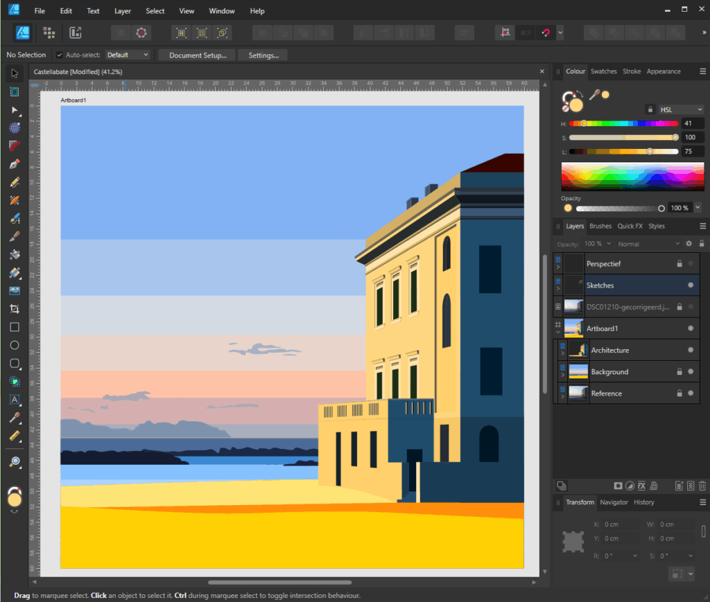
    This piece, for example. I started working on it in May 2025, triggered by a photograph taken by my wife in St. Maria de Castellabate during our honeymoon. My initial idea was to describe the dusk and the play of light on a classical building that is right on the beach. After the initial draft, it took me months to finish it. I had breaks of several weeks in between versions, during which time I allowed the piece to evolve slowly in my mind.

    Maybe it sounds silly, but traveling from A to B like this takes time, more so then effort. It needs time to ripe. To start understanding what it needs, or wants. This process can take ages.

    I find that weird. I work with digital technology, which should make creation fluent and maby even quick. But the way pieces slowly ripe makes it almost impossible to produce at a pace that modern media dictates.

    A sketch of a colourful digital artwork in progress in its imaging software. The scene depicts a vibrant Mediterranean building on the beach in Castellabate, Italy. It features bold geometric shapes and a warm sunset sky, with the building's orange and blue tones contrasting with the golden sand and tranquil sea in the background.
    St. Maria de Castellabate, thrid draft july 2025
    Photo of the beach at Santa Maria di Castellabate. The photograph depicts a classic building sitting directly on the beach at dawn.
    Castellabate beach, photograph by Astrid Spit-Steur 2004.

    Cheers, Ingmar

  • Portraits (2)

    My pen-and-ink drawings, which are simple line drawings like Matisse’s, are blending with the style of vector portraits I’ve created in recent years. I’m currently working on this self-portrait.

    A fine art black-and-white line drawing of a head looking down.
    Self portrait, digitized ink pen drawing on paper

    The first stage involved recreating rough volumes by hand using vector shapes. I like this version in its own right, but it’s not quite what I’m looking for.

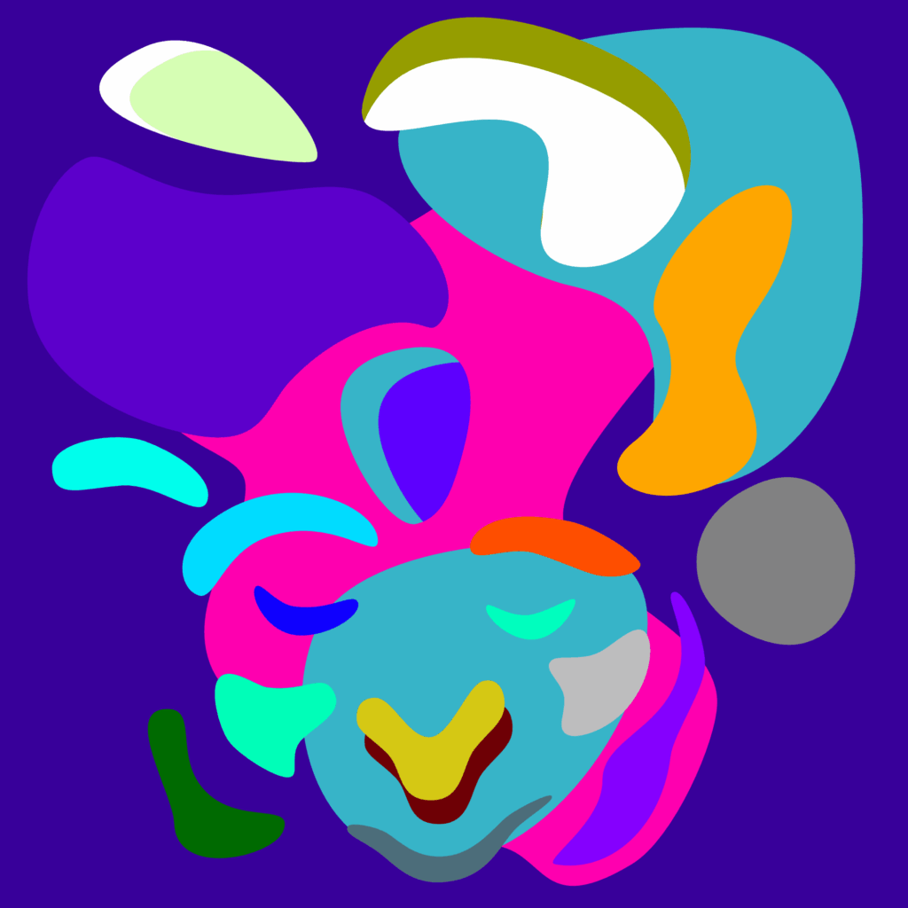
    Deconstructed abstract selfportrait in bold colors and soft blobby shapes. The colors are vibrating yellow, purple, magenta, orange, blue and green with a side of grey.
    SoFLY – Work in progress

    I made this next one after looking at watercolour landscapes. I know. It’s stupid. It doesn’t look like an aquarel landscape at all. But trust me, this is what I did after looking at watercolorings. I like this version much better. It’s not what I’m used to, which is good.

    Cheers, Ingmar

  • On tyranny

    Why are we so cruel?

    ‘On tyranny’ by Timothy Snyder. (https://timothysnyder.org/on-tyranny).

    A large, striped, colourful necktie against a bright red blouse. White liquid drips down from the neck.
    Drip – Dye sublimation print on aluminium – 80×60 cm (Gloss)

    Cheers, Ingmar

  • Portraits (1)

    Most of the portraits I create start with a brief encounter — a moment when I cross paths with someone who catches my attention. These are not commissions; they are glimpses of people whose faces linger long after they have disappeared into the crowd.

    This is a photo of a framed print entitled 'Mickey' hanging on a white wall between two windows. The print measures 55 x 55 cm. It is a colourful, deconstructed, cartoon-style image of a face against a grey background, in a lavender frame.
    Mickey – fine art print on canvas – 55×55 cm

    I recognise a familiar disconnection in the way they carry themselves — a solitude that persists even when they’re with other people. It is their facial expressions that trigger me. The reality of illness or inner struggle is etched into their faces, visible for a brief moment to a passing stranger.

    Abstract digital artwork titled "Rokende Man Een". The image shows a stylized, surreal figure of a man smoking a cigarette. His face is composed of exaggerated, brightly colored geometric shapes in electric blue, pink, and yellow. He has two uneven eyes with black pupils, mint green eyelids, and a pointed blue hat or hair shape. One hand holds a lit cigarette, with smoke rising in blue puffs. His other hand rests on a large pink oval belly. The background is split diagonally with hot pink on the left and bright yellow on the right. The style is bold and playful, resembling modernist or cubist influences, with a cartoon-like simplicity and vibrant contrast.
    Rokende man 1 – fine art print on canvas

    These portraits capture the fleeting vulnerability of awkward expressions, subtle gestures, and confused gazes. I recognise their essence: pure, vulnerable and somewhat lost. In that sense, these are portraits of all of us.

    Ingmar

  • Vibrations

    Just as in traditional printmaking, digital graphic artists create images that are transferred to paper or other materials such as metal, fabric or PVC. In digital printmaking, inks and pigments are the words I work with. My tools are code and vectors instead of cutters, brushes or etching needles.

    Photo of an art work called SQ1. It is an 80x80 cm dye sublimation print on aluminium. It is an abstract image with dancing squares in bold colors.
    SQ1 – Dye sublimation print on aluminium at 80×80 cm

    It should come as no surprise that I love bold colors in my prints. In these vibrant colors I almost feel photons hitting the lining of my retina. This is why I prefer fine art and dye sublimation prints. In traditional art I have a soft spot for dry pastels for that same reason.

    SQ1

    “SQ1” is the first print in a series of still life “Vibrations”. It’s an exploraion in color and composition, confined in an 80x80cm dye sublimation print. The image is created by writing code in an editor. If you are interested in how that works, check out this blog I wrote earlier about “Scalabe Vector Graphics“.

    The code I write generates a virtual canvas with shapes and color. Depending on the medium, the code creates images on an html pages for use on a website, but it can also be compliled into machine code that printers need to understand what they should be doing.

    I love working in code, creating color by plotting in RGB values instead of using a visual colorpicker. It helps me step away from my preferences and biases. I can more easily explore alternative color spaces and bypass my preconceptions about color and composition. I am cheating though. I end up editing every piece by hand, down to the last detail.

    On site photo of an art work called SQ1. It is an 80x80 cm dye sublimation print on aluminium. It is an abstract image with dancing squares in bold colors.
    On-site photograph of SQ1 (private collection)

    You can find SQ1 in the portfolio here. It is also available for puchase in my Ko-Fi shop, here.

    As always, stay safe.
    Cheers, Ingmar